Designing for numbers you cannot picture
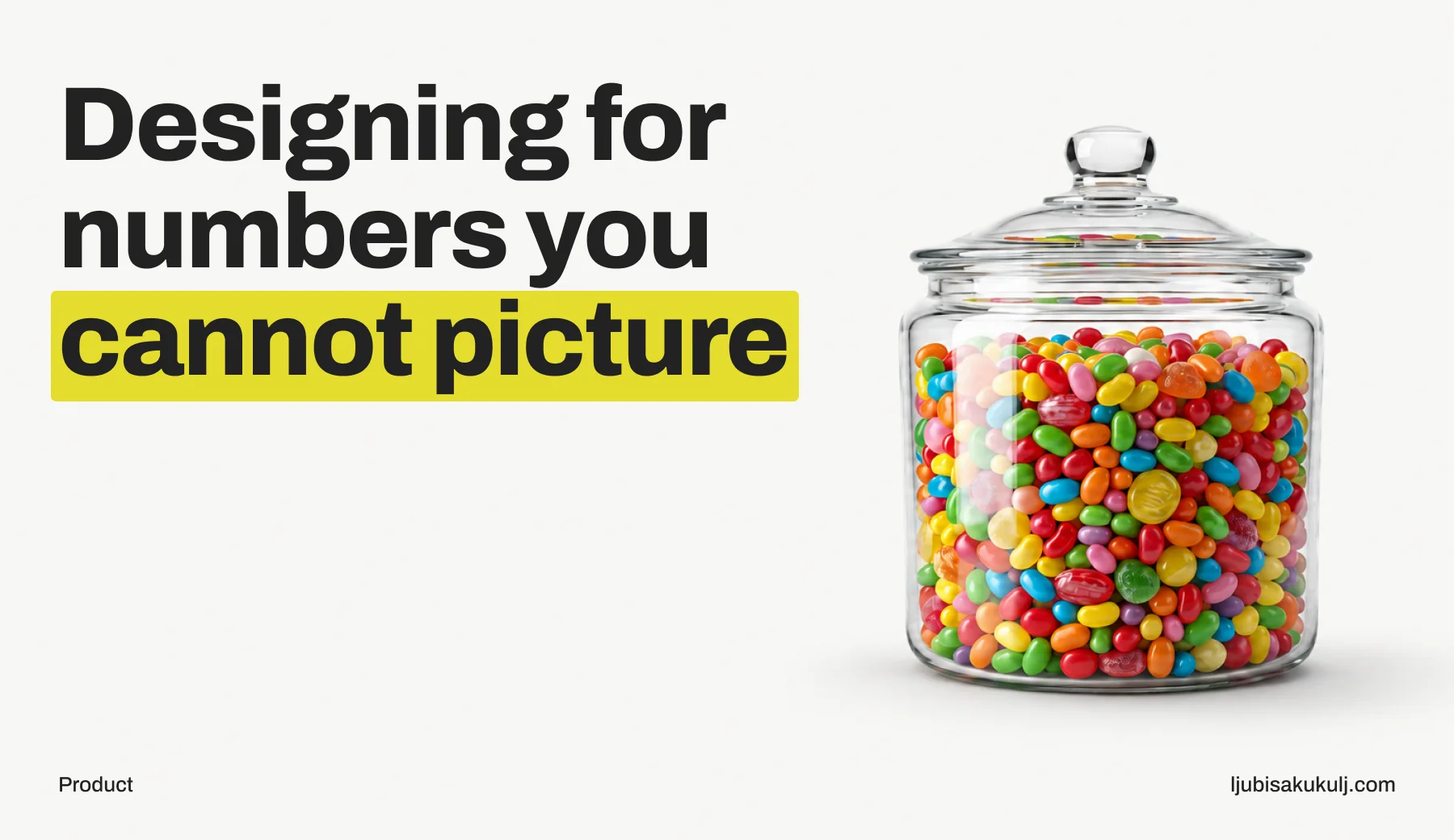
The first time I worked on something with a really large audience, the number didn’t mean anything to me. I could say it out loud in a meeting and it didn’t connect to anything. It was a figure on a slide.
A support thread made it real. We’d shipped a change that moved one control to a different position. Small change, well argued, a better screen by every measure we had. Then the thread filled up with people who’d been using the old position without looking, for years, and now had to look. Each complaint on its own was trivial. Added together, they came to more human hours of irritation than our whole design process had spent making the change.
That’s what scale does, and I still don’t think it ever fully fits in your head. The screen is the small part. What you actually ship is a policy, applied millions of times, mostly to people who never asked for it and will never tell you what they think of it. Does that match what you’ve seen?
A default is a decision you make for someone else
At a small scale a default is a convenience. At a large scale the default basically is the product, because almost nobody changes it.
Whatever you preselect is what happens. The unit, the sort order, the notification frequency, the privacy setting you ship already ticked. That becomes the behaviour of nearly everybody. The settings screen mostly serves a vocal minority. Everyone else lives with what you picked for them.
So picking defaults deserves more design attention than most of the visual work around them, and in my experience it usually gets less. A default is a one-line code change and an afternoon of arguing, so it feels small. I don’t think any other decision on the product pays back as much, though.
My test for a default is simple: if this were the only option, could I defend it? Because sometimes a setting exists mainly so we can point at it later, after a bad default has shipped. When that’s the case, the setting is there for us more than for them, and I’d rather notice that before shipping than after.
Rare events are common events
With a hundred users, a bug that hits one in a thousand sessions doesn’t really exist. You’ll never see it. With millions of users, one in a thousand is a steady line of people at your door, all day, every day.
That reorders which problems matter. The empty state that only shows for people with no history. The layout that breaks past thirty characters, which sounds exotic until you look at real surnames. The flow that dies on a slow connection at the worst possible step. The date format that half the world reads backwards. You’d be right to deprioritise these in a small product. At scale they turn into a full-time source of frustration, and usually nobody owns them.
And your instrumentation hides them by design. Analytics show aggregate behaviour, and the aggregate is dominated by the common path. A problem hitting a small percentage of people is invisible in a funnel chart and enormous in absolute terms. You’ll only find it if you go looking on purpose, segmenting by the conditions that produce it instead of staring at the total.
The audience itself is also stranger than any research panel. Old devices. Bad connectivity. Screen readers. Borrowed phones. Languages that break your layout in ways you didn’t know layouts could break. People in a hurry or in real distress, doing all of it on a moving bus. With a small product you can design for a typical user, because your users really are fairly typical. At scale there isn’t a typical user. There’s a range, and the edges of that range have real people in them.
Change gets paid for by the people who learned the old version
This is the part that clashes hardest with how product teams like to work.
A redesign has a visible cost, the effort of building it. It also has a hidden cost: the relearning you impose on everyone who already internalised the old version. With a small user base the hidden cost rounds to zero. With a large one it can swallow the entire benefit, and the people paying it were perfectly happy with the old version.
Products that stop changing rot, and some improvements are worth real disruption. But the bar sits higher than it feels from inside the team, because the team gets all the upside and doesn’t do any of the relearning. I don’t have a formula for where the bar should be.
What has helped me: move the most-used controls least, and spend the disruption budget on parts people touch rarely. When something has to move, keep a bridge open for a while. Roll structural change out gradually, because a big-bang redesign concentrates all the relearning into one bad week. And ask honestly who benefits. If a change mostly makes the product easier to show in a sales deck, your existing users shouldn’t be the ones paying for it.
One more thing I’ve learned to distrust: my own boredom. Teams get tired of an interface long before users do. I’ve stared at some screens for two years. The user glances at them for four seconds a week and never thinks about them again. Me wanting it to look different doesn’t mean it needs to.
What tests measure, and what they miss
Experimentation at scale is really useful. I also think it gets more trust than it has earned.
An experiment measures the days right after a change, on people meeting it for the first time. The effects that matter usually run longer. Novelty inflates the early numbers of anything new and shiny. Habit depresses the early numbers of anything that moved. Both wear off, and most tests get read before that happens.
Tests also measure what’s convenient to measure. Clicks, completions, time on task. Whether someone now trusts the product less, whether the completed thing was the thing they actually wanted, whether that completion is a mistake they’ll reverse next week: none of that shows up unless you specifically instrumented it. A change that lifts completions and lifts reversals is a loss that looks like a win, and you only catch it if the reversal is on the chart.
So before running a test I write down what result would make me kill the change, and which number would show harm rather than benefit. If I can’t describe failure in advance, I’ve noticed I don’t recognise it afterwards either. Do you do something similar? I’d like to know what other people write down before they test.
Turn percentages into people
One habit keeps all of this from turning into pure statistics for me.
A tenth of a percent of a very large audience is a stadium full of people. If a flow fails for them, calling it an acceptable loss rate is a framing trick. That stadium holds more people than most products serve in their lifetime. Written as a percentage, it slides past everyone in the room. Counted as people, it’s a stadium, and you have to look at it.
So I convert percentages to people before any decision. It happens to work well in meetings too, but that’s a side effect. I do it because it’s more accurate, and because I’m less likely to fool myself.
What holds up
After years of this, the practices that survived are the unglamorous ones.
Spend disproportionate time on defaults, empty states and error states, because scale concentrates exactly there. Touch the most-used things as little as you can. Segment before you conclude, since the aggregate hides whoever you’re hurting. Instrument the harm with the same care as the benefit.
And stay in contact with individual users, even when there are millions of them. Read some support threads yourself, with your own eyes. The aggregate view is what decisions get made from, and it’s hopeless at telling you what it feels like to be on the receiving end of them. You need both views. The second one tells you which questions to ask the first. If you’ve found a better way to keep millions of people real while deciding things for them, I’d like to hear it.