When friction is the feature
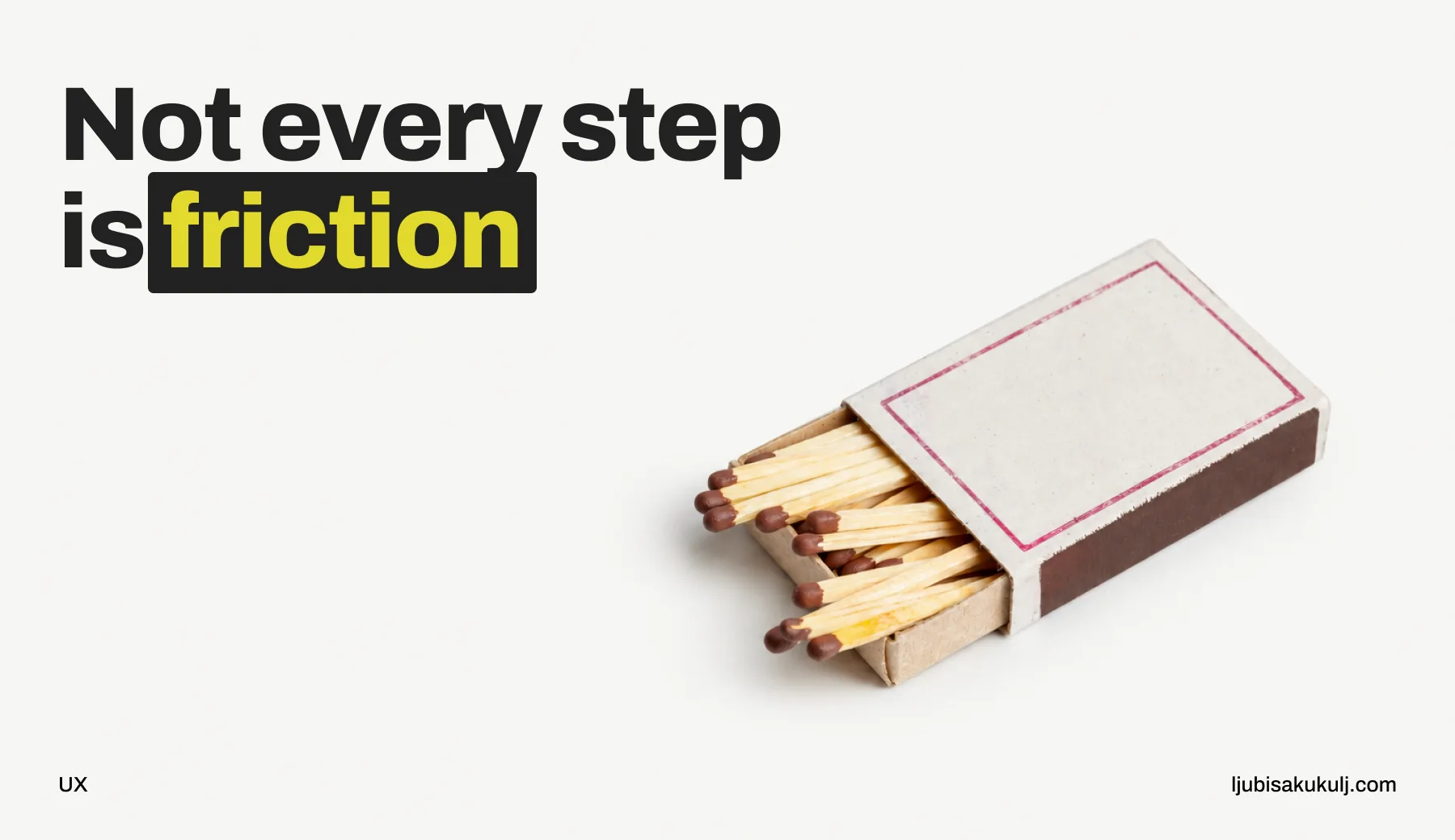
Reducing steps is the closest thing our field has to a reflex. Cut a screen here, a field there. It’s the easiest improvement to propose in a meeting and the easiest to measure afterwards, and for most of a product it’s the right call.
Then you start working on something where the action can’t be taken back, and the same reflex starts doing damage. I want to talk through why, because I’ve spent a good part of my career in exactly that territory.
A button press that moves money out of an account. A legally binding signature. An identity asserted to a government system. An order released to a warehouse that won’t read your apology email. Once you’re there, I’ve found the question changes. You stop counting steps and start asking which ones are actually doing something.
Undo is what makes speed safe
Most of the design advice we all grew up on was written for reversible actions. Delete an email and it sits in a folder for thirty days. Post something, edit it later. Buy a subscription, cancel it tomorrow.
When undo exists, speed is basically free. A mistake costs a few seconds of annoyance, so the right design lets people move fast and fix things after. In that world a confirmation dialog really is bad design. You’re taxing every correct action to prevent a mistake that costs nothing.
Take undo away and the whole calculation flips. Now a mistake is a bank transfer to a stranger. A signature on the wrong contract. A filing in a public register with your name on it. The extra step costs the user the same few seconds, but now those seconds are preventing real damage.
So instead of asking whether something is friction, I ask two things: what does a mistake here cost, and who pays? If the user pays, in money or in legal exposure, and can’t get it back, then a step that forces attention is doing the job the product exists to do. Does your team ask that question, or does the step count win by default? In my experience it wins by default far more often than it should.
Why “Are you sure?” doesn’t help
None of this is a defence of the confirmation dialog. To be honest, I think it’s the laziest tool in the box. Everybody answers “Are you sure?” with yes. Everybody, including the person about to make the exact mistake you were worried about. The dialog creates the feeling of a safeguard without the function of one, and I’d argue that’s worse than nothing, because the team now believes the problem is handled.
What actually works is anything that makes the person show they know what they’re doing, instead of just asserting it. A few things I’ve used:
Ask them to re-enter the one detail that hurts if it’s wrong. Only that detail, never the whole form. Typing the last four digits of the destination account is a different mental act from clicking yes. It makes a person look at the thing they’re about to affect.
Write the summary in their language instead of echoing the form back. A field list is data. What the person needs is a claim about the future: what will happen, to whom, and when, written the way they’d say it to a friend. Someone can read that and think yes, that’s what I meant. I’ve never seen anyone react that way to a table of fields.
Better still, give the action a delay with a real exit. For a short window the action is scheduled instead of executed, with a visible way to stop it. This is the strongest instrument I know of, because it turns an irreversible action into a reversible one for a while, and when the person was right it costs them nothing. It also needs real backend work, which I suspect is why so many teams ship a dialog instead.
And make the destructive path feel different to use. A red button won’t do it, people stop seeing red buttons within a week. Move it somewhere else, or give it an interaction that isn’t already automatic.
The two halves of a serious flow
Here’s the framing I use most. A serious flow has two phases, and they want opposite treatment.
First comes composition, where the person assembles their intent. Choosing the recipient, entering the amount, picking the document. Everything we know about speed applies here in full: autofill, sensible defaults, remembered recipients, forgiving input formats, nothing asked twice. Make this part as fast as you possibly can.
Then comes commitment, the single moment where intent turns into consequence. This moment should be slow and unambiguous. One clear statement of what’s about to happen and nothing else on the screen competing with it. No upsell, no cross-sell, no newsletter checkbox, no animation pulling the eye away from the sentence that matters.
Where I’ve seen teams get into trouble is running the whole flow at one temperature, and it costs them either way. All ceremony teaches people to click through ceremonies. All speed lets the commitment moment slide past as one quick step among many. What you’re really managing in a flow like this is attention, and a step count tells you nothing about where it lands. That’s the part I try to explain in reviews.
The number that rarely makes it into the meeting
There’s a practical reason this argument keeps losing inside companies.
The benefit of a removed step shows up immediately, in a funnel chart, attributed to the team that removed it. The cost shows up months later as support volume, reversals, complaints and churn, attributed to nobody in particular. One number moves this quarter. The other is spread across the whole year and lands in a different department’s budget.
If you want to win this, bring the second number into the room. Reversal rates. Support contacts per thousand completions, sorted by cause. Time between completion and first complaint. How many transactions people tried to stop after starting them.
I’ve watched well-argued design principles lose to a conversion chart many times. I’ve almost never watched one lose when the reversal rate was plotted next to the completion rate. My reading is that safety arguments usually fail because they arrive unmeasured, and I’d be curious whether your experience matches that.
Getting the dose right
The dose matters more than the principle, because the opposite failure is real too. A product that treats every action as sacred teaches people to stop reading, and then the one screen that truly mattered gets dismissed with the same reflex as the twenty that didn’t.
This is my rough calibration, after years of adjusting it, and I’m still adjusting:
If the user can reverse it themselves, make it fast and make undo obvious. No confirmation at all.
If only support can reverse it, show a clear summary before commitment. From the user’s point of view, a reversal that needs a phone call is a punishment, whatever we call it internally.
If nobody can reverse it and the user pays the cost, ask for an act of attention that a distracted person can’t perform on reflex, and keep an exit open for as long as the system technically allows.
And if nobody can reverse it and the cost lands on someone who isn’t even in the room, which in identity and public sector work happens more often than people expect, then the interface owes care to a person who never agreed to use it. I’ve never been given a conversion target that I thought outranked that case, and I don’t expect to be.
The part that stays with me
The people most affected by these decisions are almost never in the room when we make them. They’re stressed. The domain is foreign to them. Half the time it’s a borrowed phone or a shared computer, a first and probably only attempt. And when it goes wrong, they’ll blame themselves.
Designing for that person sometimes means defending a step that makes a chart look worse. I didn’t win every one of those arguments, and the lost ones still bother me. The ones I did win never came back to hurt anyone, as far as I know. If you’ve been in the same argument and found a better way to make the case, I’d like to hear it.